Organisation type
Charity/third sector
Membership organisation
Sector
Health and social care
Service
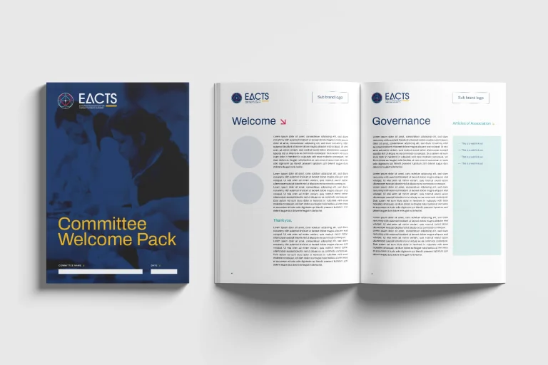
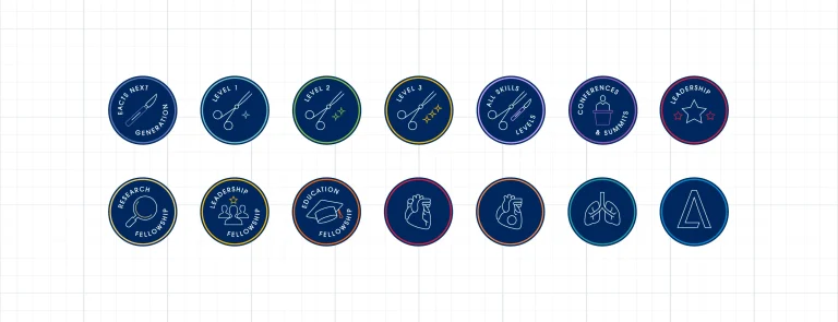
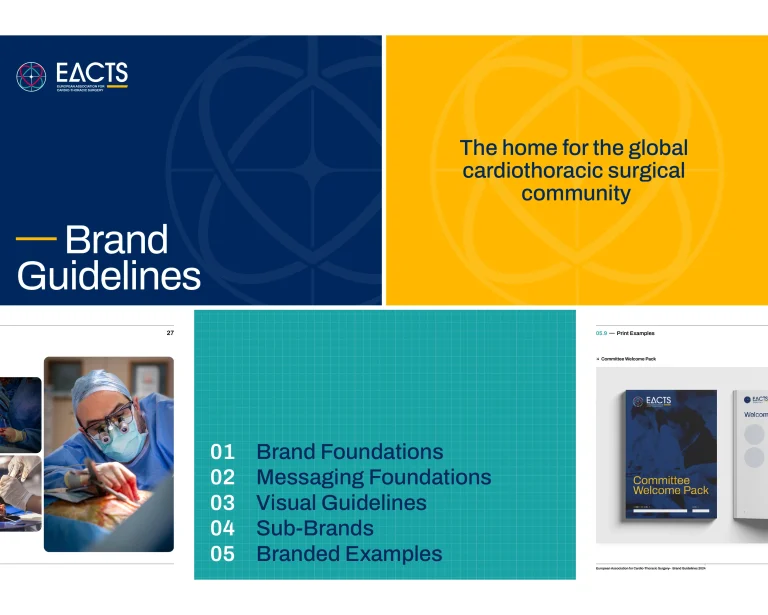
The European Association for Cardio-Thoracic Surgery (EACTS) represents the global cardiothoracic surgical community. As the organisation embarked on a new five-year strategy, it recognised the need for support from a branding agency to reflect its evolving role and ambitions.Working closely with EACTS colleagues, we were asked to create a brand architecture that would simplify its growing portfolio of sub-brands while strengthening the overall identity. The goal was to position EACTS as a progressive, inclusive and innovative organisation — one that champions excellence in patient outcomes and community collaboration.
Our work began with a deep immersion into EACTS’s world. We interviewed and surveyed members, employees and Council members, combining insight with strategic analysis. Through workshops and landscape research, we identified opportunities to align the brand’s purpose, values and visual identity with its new strategy.
We developed three creative territories:
This process revealed that the new brand needed to be forward-looking yet authentic — evolving rather than reinventing — to inspire pride across the EACTS community.
The final brand is built around a clear new vision and purpose:
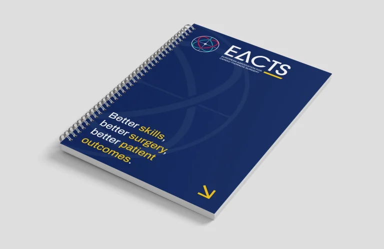
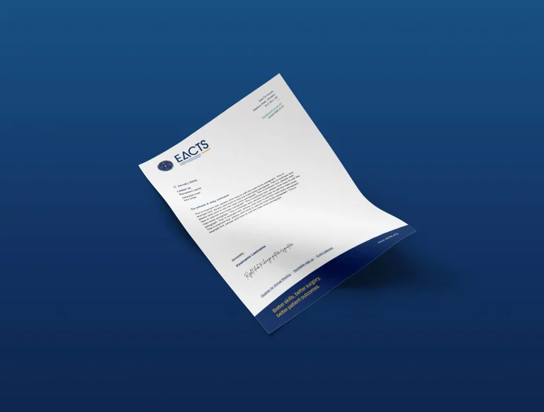
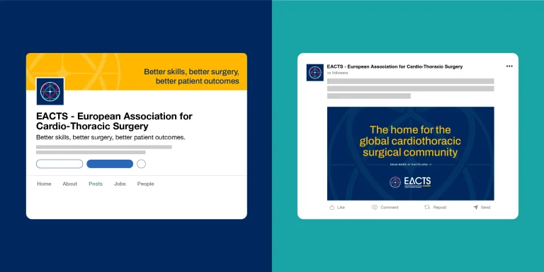
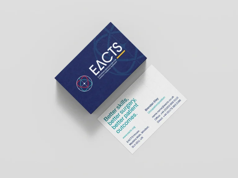
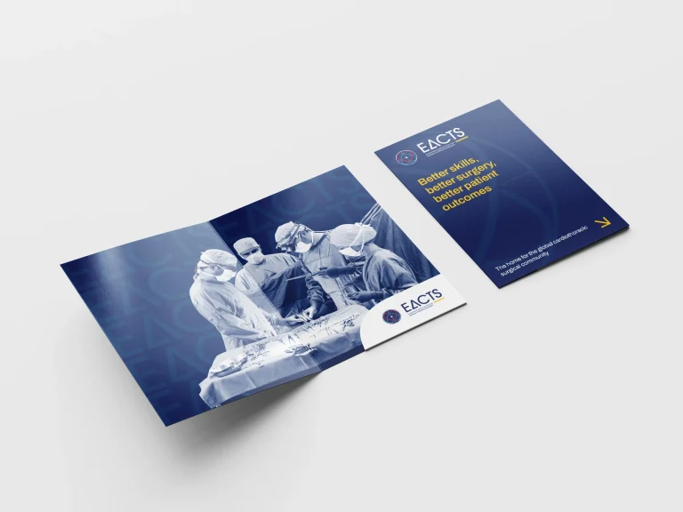
Better skills, better surgery, better patient outcomes.
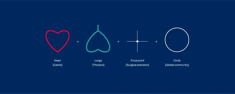
The refreshed identity unites the heart and lung communities through a logo that balances precision and collaboration — sharp, clean lines echo surgical tools, while ECG-inspired textures and a renewed colour palette connect to EACTS’s heritage.Together, the new design and messaging system future-proof the organisation and reflect EACTS’s role as a trusted, global leader in cardiothoracic surgery.

Want to chat?
Feel free to contact our team.