Refreshing the brand for a new government initiative

The Brief

The Government Office for Technology Transfer (GOTT) helps accelerate government’s innovations towards the market, to impact growth and deliver new products and services for citizens.

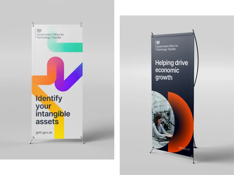
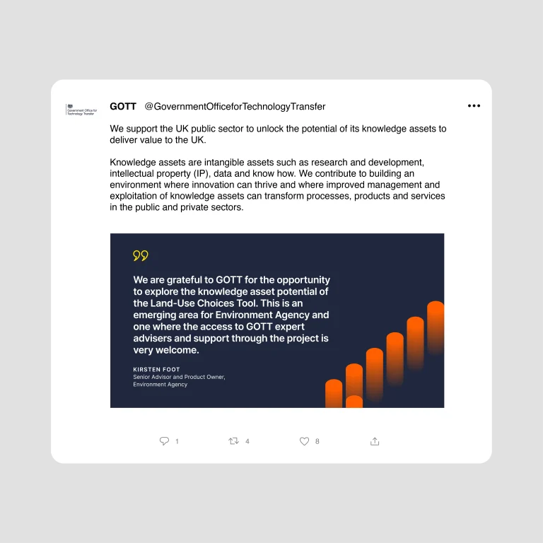
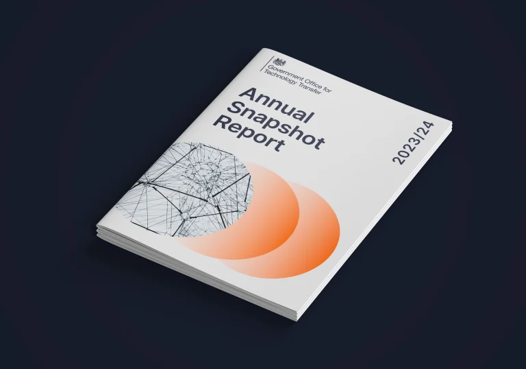
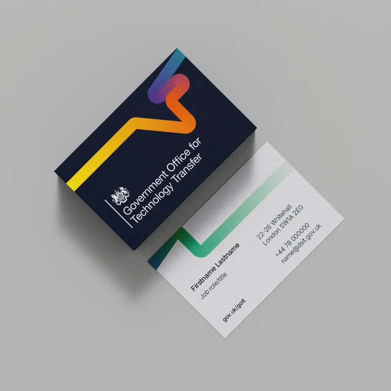
For this public sector branding project, we needed to rework the GOTT brand into a distinctive, accessible and adaptable brand that represents the dynamic, innovative work GOTT does and its authority in the space.

Key considerations were to:

  • Show an evolution, not a revolution
  • Ensure AA accessibility, practicality and usability for the team
  • Maintain recognition and make sure it felt ownable within DSIT

Insights and Approach

We split the work into three phases: immersion, creation and delivery.

Key to the immersion phase was doing an in-depth brand audit, where we laid out all designed assets on a virtual board which helped us identify common themes, challenges, errors and room for opportunity.

Given the need to improve the usability of the brand, we spoke with key users within the team who told us about previous struggles.

After a typical iterative design process, the new brand was signed off swiftly.

A training session with the team, in which we ran a live “make-your-own-slide-deck” exercise was a helpful way to convey the journey of the brand and to allow them to test it while we were on-hand to offer technical support.

The Outcome

The brand initially used complex, layered graphic assets to represent its three brand pillars: collaboration, innovation, acceleration. Movement and transfer were represented effectively but it was difficult to understand their deeper meaning.

So, we deconstructed the visual language, retaining successful elements which conveyed movement and transfer, but simplifying them and explaining in the guidelines that they no longer needed to represent anything specific.

The brand became far more practical and usable for all, while retaining the spirit of the previous visual identity.

I have been delighted with the high quality of design work and approach to the project from Barley. From the initial kick-off meeting to the final delivery of the guidelines, the team demonstrated a good understanding of our brand. The project was completed on time and we are finding the new guidelines easier to follow and now have a brand identity we can be proud of.”

Louisa Kane | Head of Communications, GOTT